Medint management board
Role: UX/UI
Overview
Medint has developed a unique algorithm-base technology to identify information that is relevant to the patient case, with a focus on evidence-based material, statistics, case studies, testimonials, and more.
The main goal of the product is to help patients get all the information that’s relevant for their special case in order to collaborate with their physician and make the right medical decisions.
Target users
The research coordinator is the connecting link between the lead researcher and the research team (and in some cases between the patients to the research team).

Researchers Coordinator
- Assigns researchers to cases
- Makes sure that cases are on track
- Coordinates between patients and the research team
The challenge
The dashboard wasn’t providing the needed information.
Although it’s the coordinator’s main tool to get an overview of the cases and research team, the dashboard only displayed high level information.
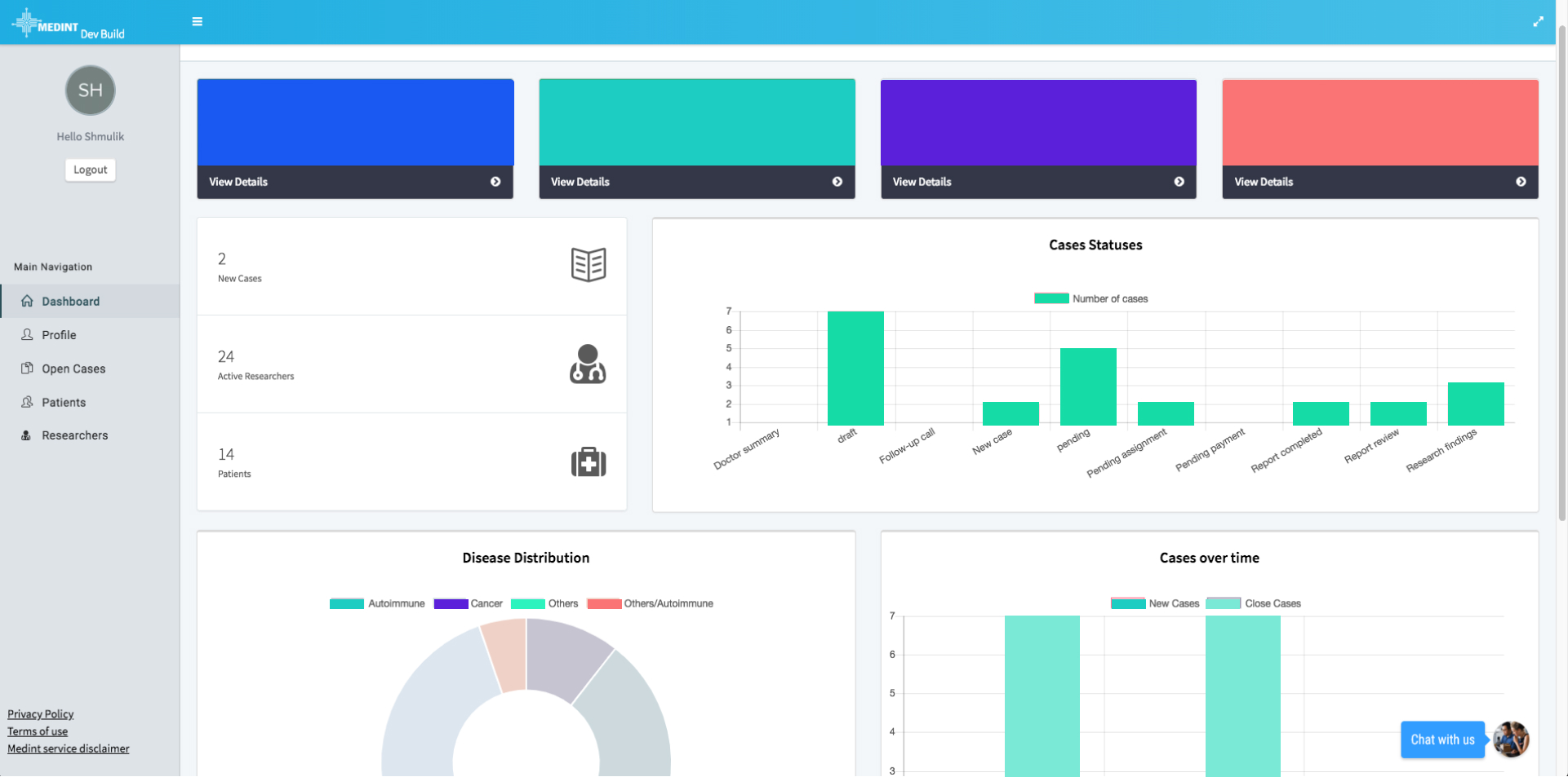
In order to work, the coordinator had to look in 3 different areas of the platform to get the relevant cases details: The dashboard, cases view, and the researchers’ lists. We needed to consolidate this workflow into a one screen
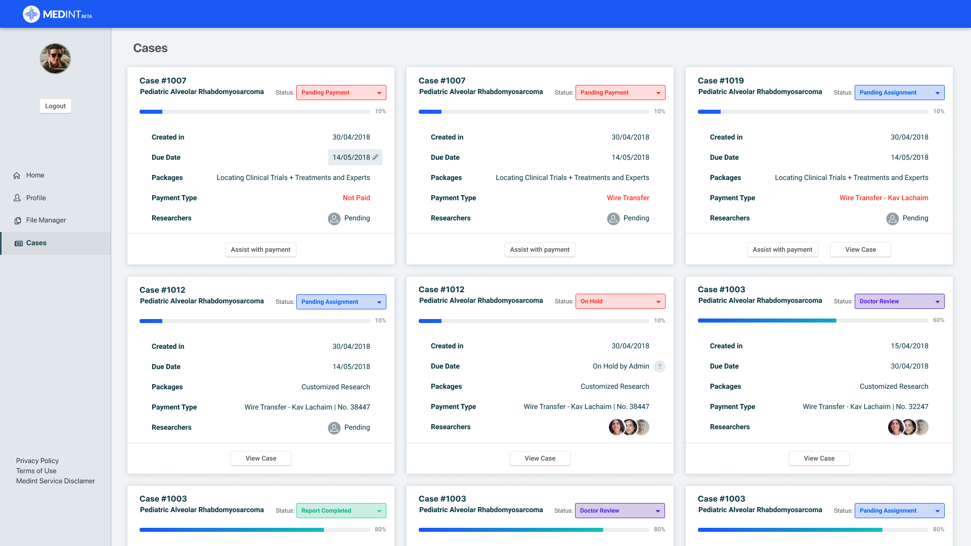
More cases, more scrolling
Cases were displayed in a card view on the ‘cases view’ screen. As more cases were added to the screen, the long scrolling had the coordinator disoriented.
The cards took too much real estate, making it hard to locate specific cases (such as “on hold” or priority cases) or to compare cards.
Secondary objective
In order to provide patients with the best report, the coordinator must find the best
matches between researchers and cases. Having no in-platform means, he used 3rd solutions (a phone call, WhatsApp, email etc.) which were not documented.
The solution
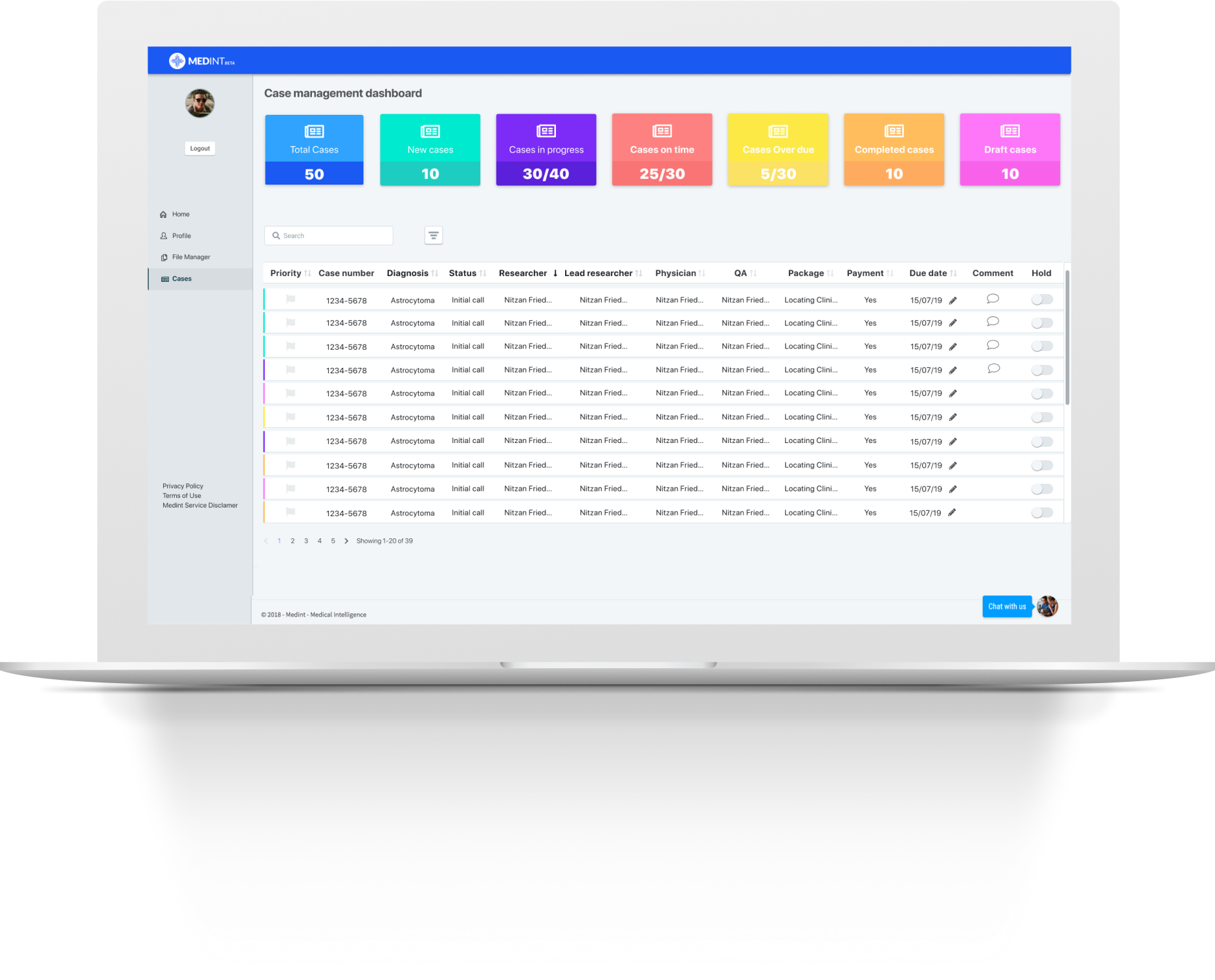
We consolidated the cases view screen with the dashboard, so the coordinator will have all the information in one place, and the graphs have been revamped as quick filters, and a search bar was added.
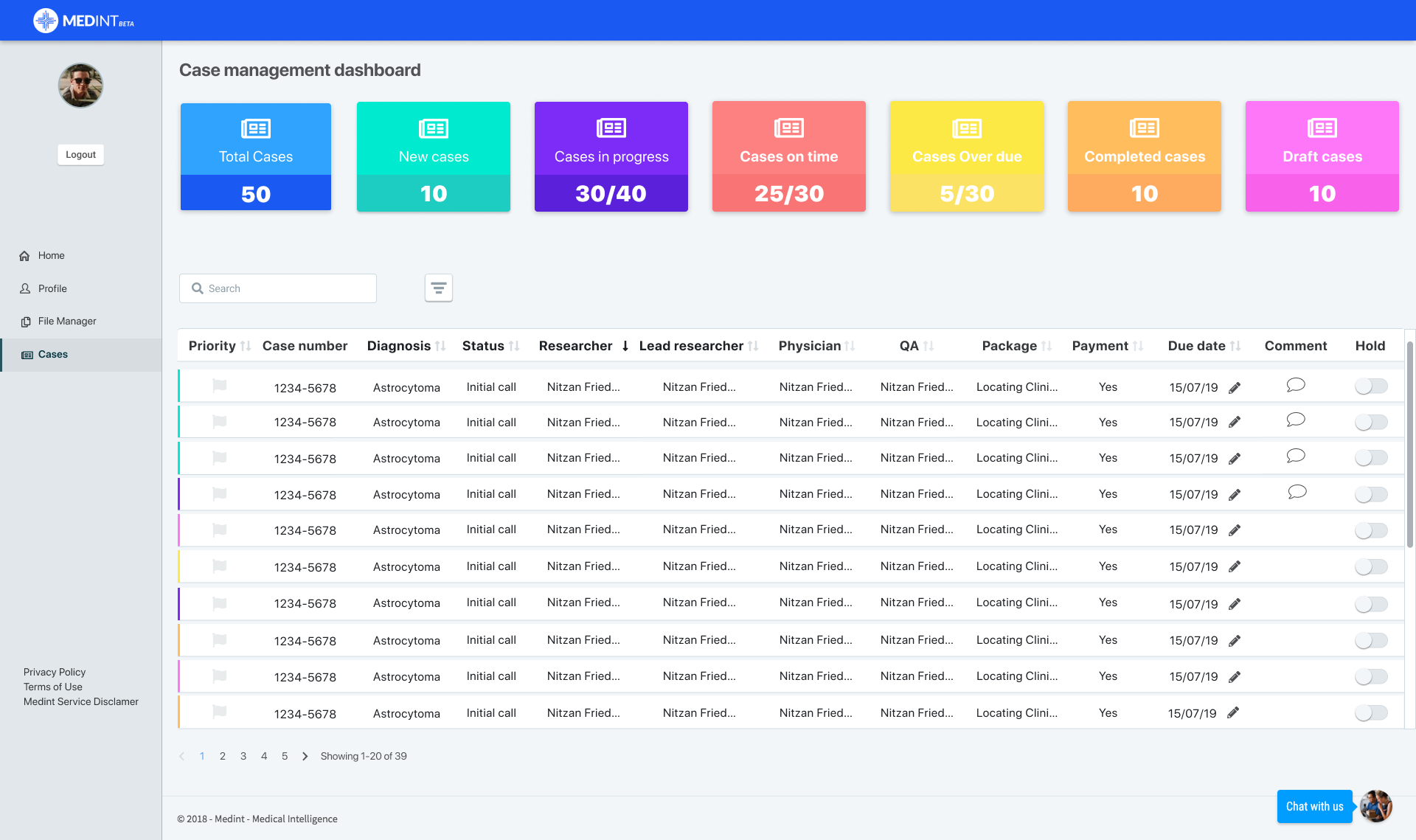
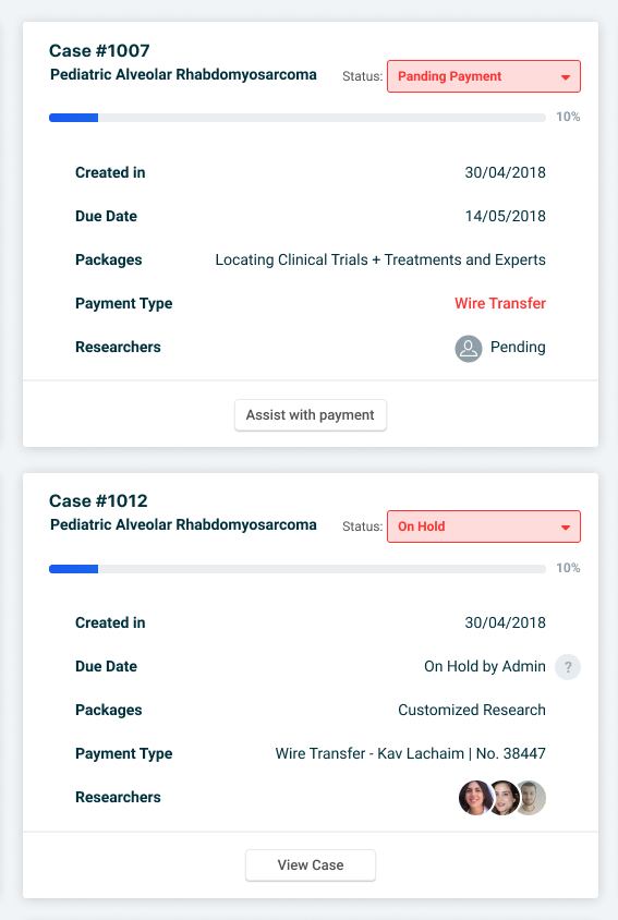
Changing ‘card view’ into ‘table view’
Each case is now represented by a single line with essential information to help the coordinator pinpoint the needed case.

Important information is now easy to find
The new table highlights “on hold” cases. Hovering on the info icon displays a tooltip which reminds the coordinator why the researcher’s requested this hold.

Important information is now easy to find
Notes
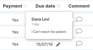
Due date

Priority cases
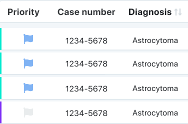
Highlighted cases that needs a coordinator action
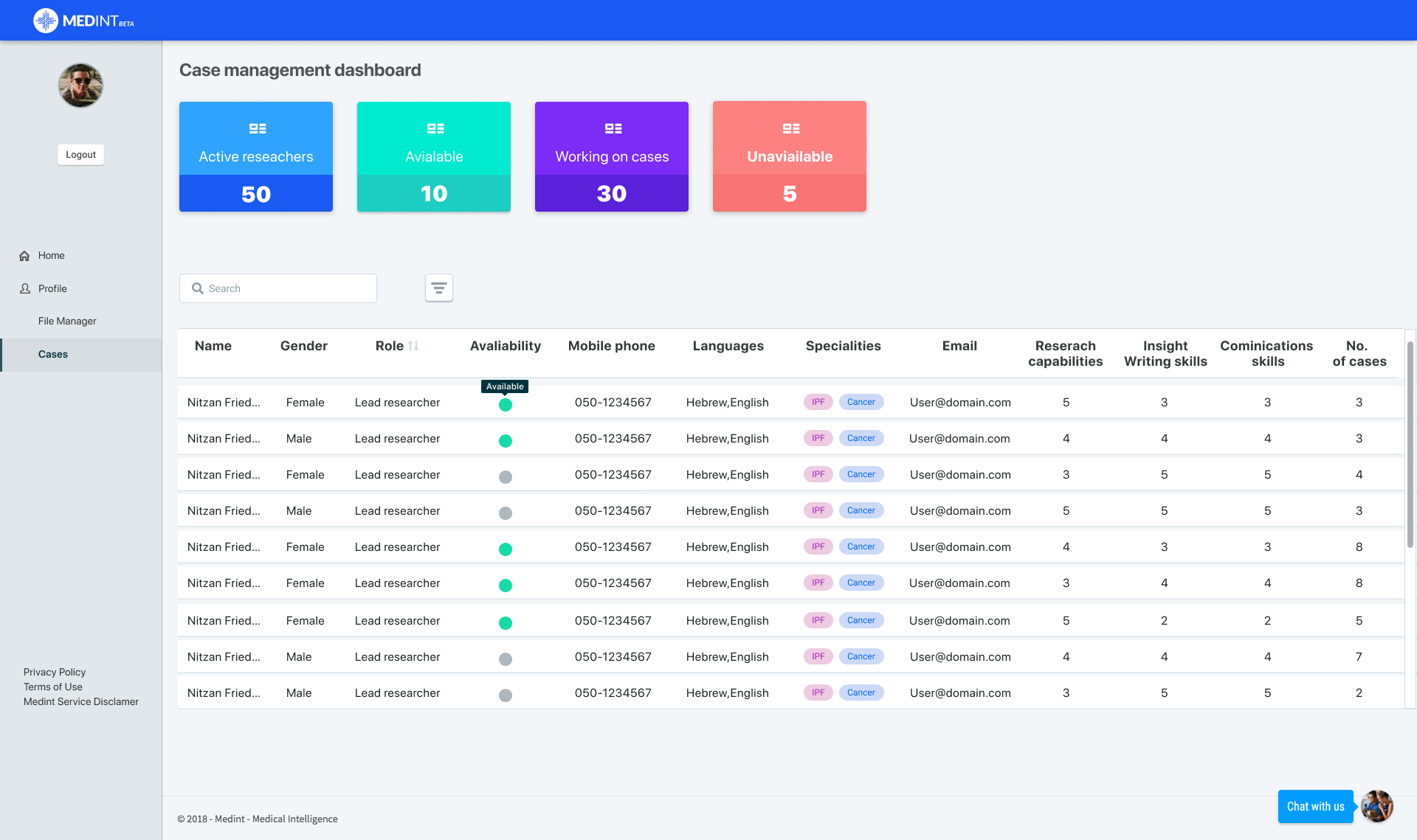
We added more information per researcher (such as specialty, availability and KPI’s) to help the coordinator with finding better matches and better manage his available resources.
