Medint design system
Role: UX/UI
Overview
As Medint’s platform became more diverse with more tools and features, it became clear to me that we need to maintain a consistent style and visual language across all areas of the product. We also needed a more systematic way to develop in order to keep up with tight schedules and avoid ‘one-of-a-kind’ solutions.
The initial outcome was to have a collection of reusable components, guided by clear principles, that can be combined to create either simple or complex experiences, according to the needs.
The challenge
1. Planning and prioritizing
The development team was always working on a tight schedule, so even though the team understood the importance, the need to produce new features usually overcame daily tasks such as working on our design system. It was imperative to find a silver lining.
2. Methodology
When working in a small team in such a rapid development, communication between UX/UI and R&D is crucial. We had to tackle the way we wanted our design system to be maintained and updated. The discussion revolved around the design system’s platform, documenting components behavior, defining priorities when writing documentation, and misc. information,
3. Rallying everyone to the cause
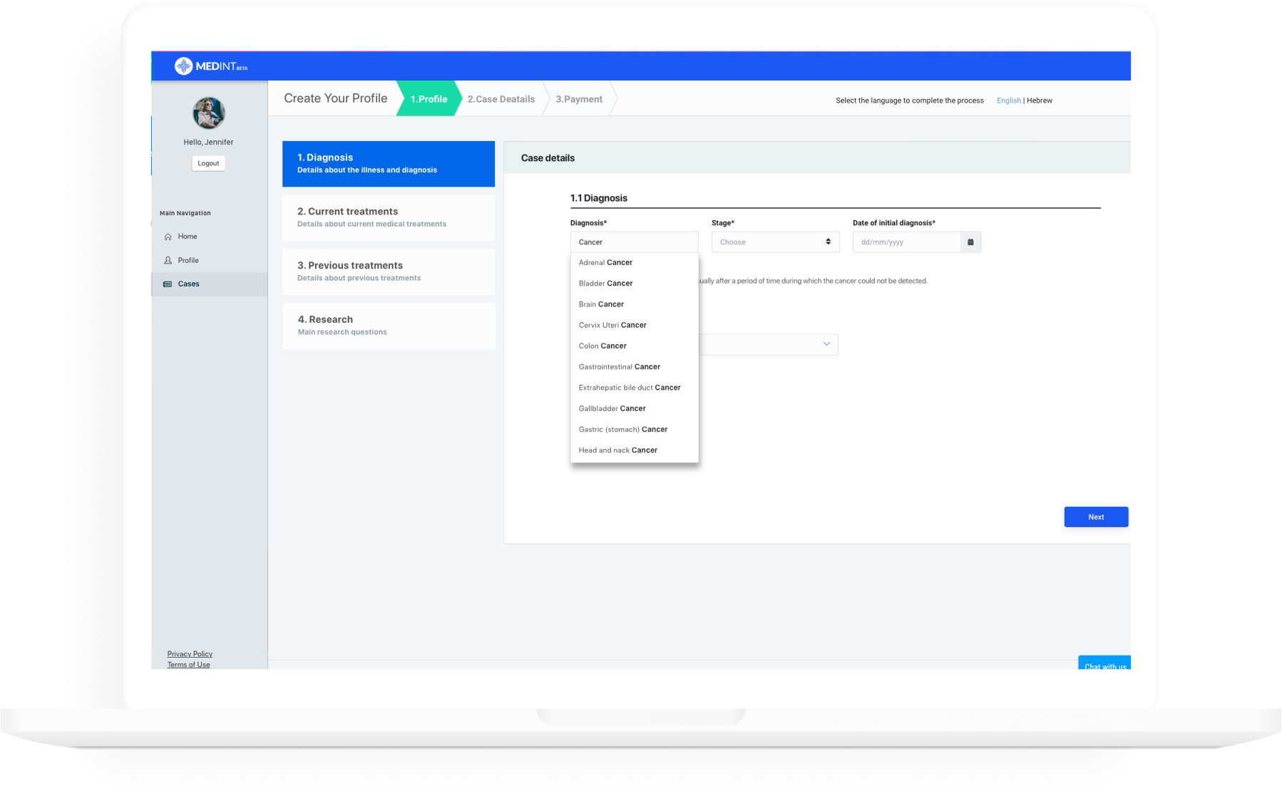
Previously designing the system was made intuitively, so when the design QA was conducted, there was a considerable gap between the original design and the developed feature. We had to align everyone (design, production and development) to a one standard, with a defined design principals and components, which is, our design system.

My goal
A ‘one-source-of-truth’ – one constantly updated resource file for designers and front end developers
- Create a design system to keep the platform consistent
- Reduce the design output and development output gap
- Improve development time by creating common components to be reused throughout the development process
Discovery
The first step was to review every aspect of the platform and document the components to try and find common denominators. I mapped everything from basic assets such as colors and fonts, to components such as buttons, cards, tables, filters, etc.
During this process, I tried to group the many inconsistencies I found by visual similarity and/or functionality.

Research
I started with an online research, looking for existing researches on methodologies for building a design system. Finally, I settled on well-known method which I felt will strongly enhance my output – the Atomic Design method. The key idea behind this methodology being small, independent – atomic – parts, can be combined into larger molecular structures.
Next, I examined well-known design systems that use this methodology and summarized all my research into these parameters:
- A suitable platform to build my design system
- How best to divide the information, and the level of detail for each section
- Important information for each team member (Design, development, product) and collaboration protocols
- How to create flexible and reusable components
Research
I used 8 PX grid which means that every element in the system
can be divided by 8.
Colors
Our system used too many colors. After an audit I minimized the color to the minimum possible which still won’t harm the already developed components.
Typeface
I consolidated the main typefaces of the platform to SF and Roboto and defined proper styles.
Icons
Similar icons were consolidated as well into a ‘most used icons’ table.
Form elements
I defined the form components, so all behaviors will feel and behave similarly across the various forms.
Bringing it all together
Now it was time to pen the ‘atoms’ for the platform – colors, typography, icons, etc. At this stage I started to backtrack and correct inconsistencies.
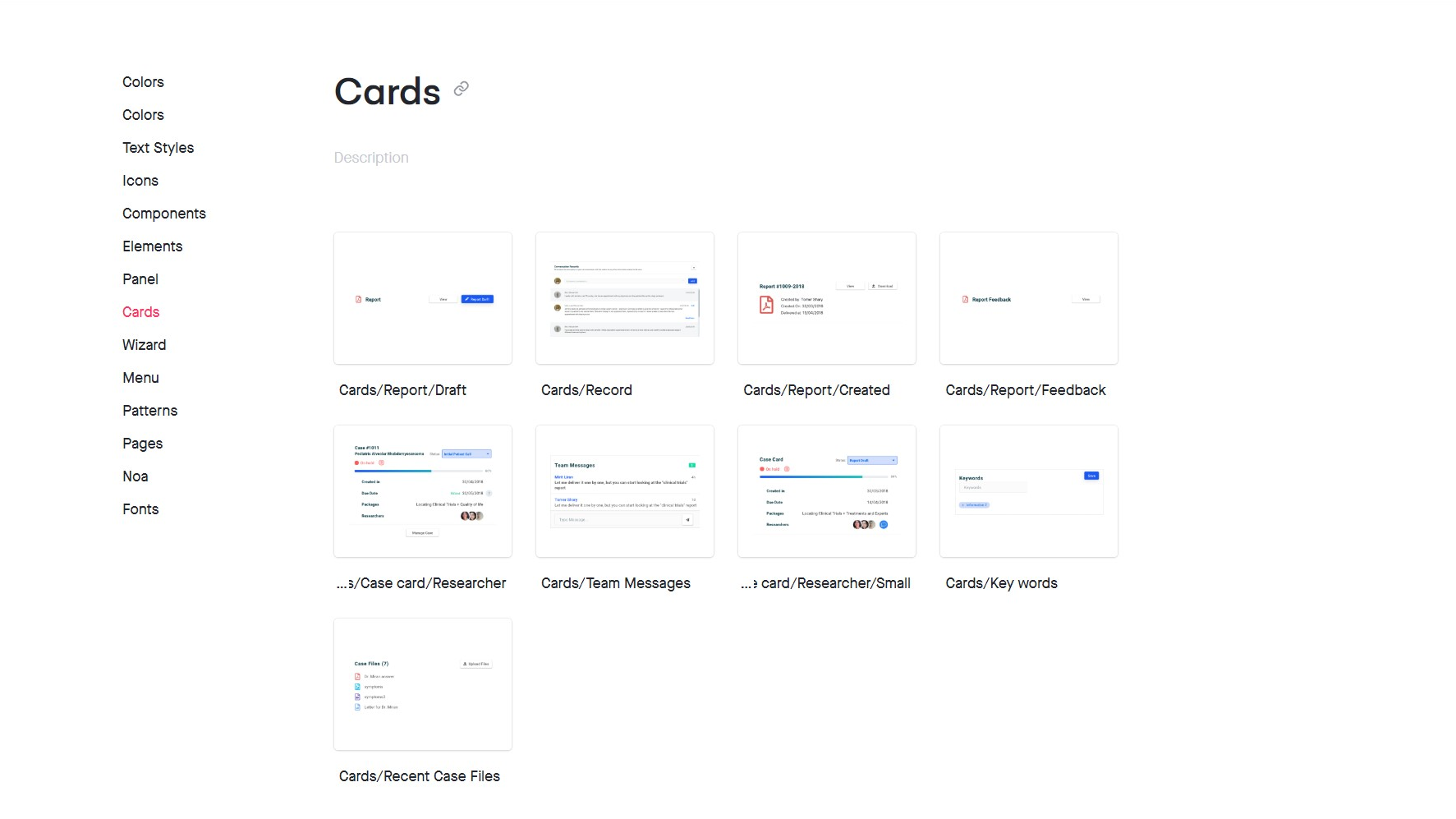
Building the components, I started grouping the elements in a one master file to be used as a library. When the library grew bigger, I separated each component into a different page, sorting them by categories: colors, buttons, fields, cards, tables, etc.
I conducted a team meeting to define the platform that will host our design system, and suggested several solutions. Eventually, InVision was chosen due to its ability to synchronize with Sketch (which was used by our team) and because of the developer’s familiarity with it.
Mobile
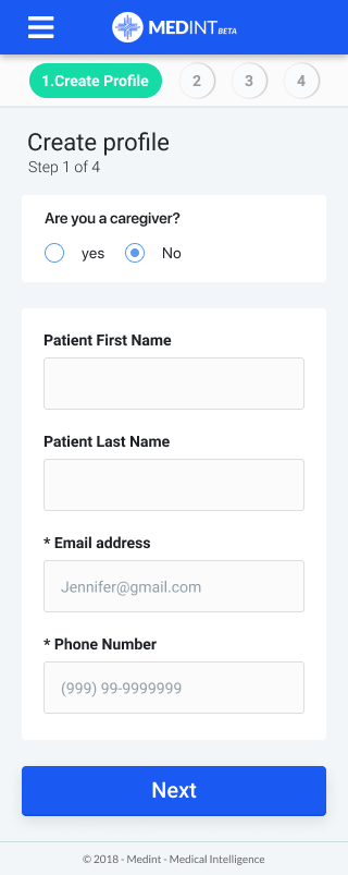
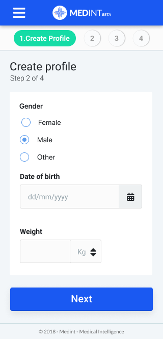
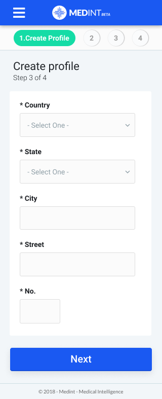
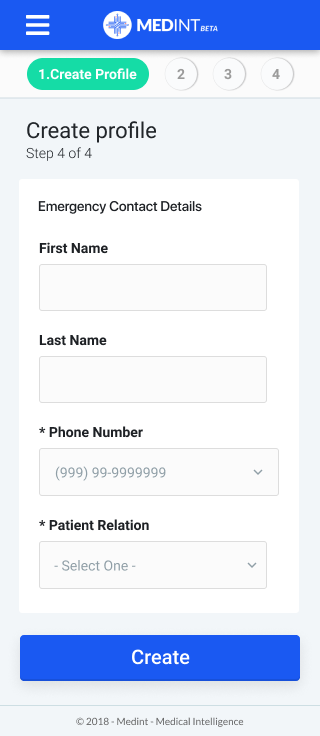
Having a design system in place, creating a mobile version for the platform was a much easier task. The flexible system I designed enabled me to use common components when working on the mobile version. It was also easier for me to communicate the requested feature changes the mobile version required to the developers and stakeholders.
My two cents
Design system is not a task
It is a way of life. When we as designers start working on a product, we need to start grooming a design system. This is an ongoing process, and not a one-time task. It will become a keystone which will evolve and guide the production forward. It has a great impact on the collaboration quality of the team
Creating a good design system requires collaboration
Ultimately, the developers need to work with the design system. They must be familiar with its structure, the platform it was created on, and the rational which was used to document the features. For that, they MUST be part of the design system creation process and contribute their own point of view.
Introducing a design system at a late stage is a pain
Working on a design when a system is already developed, takes significantly more time, and it can become a huge task (for both the designers, and the developers who will have to fix inconsistencies). Sometimes it might even be easier to simply use this as an excuse to overhaul the design. But In either case, the only way that such a design to be adopted, is if the entire team would be willing to accept this change, and if there is a strong PM to enforce this change.
