Back to work
Case study · Medint · HealthTech B2B

One board, instead of three fragmented views

I designed the management board for Medint's care coordinators, consolidating three fragmented views and off-platform workarounds into a single dashboard for case oversight.

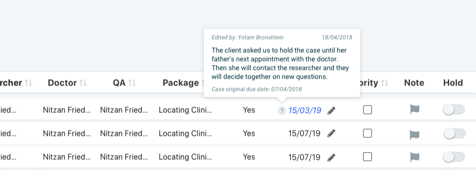
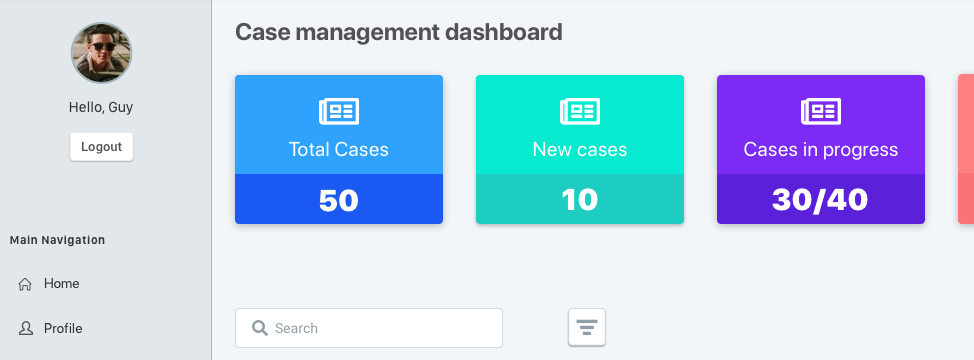
Medint management board — consolidated case dashboard
Medint's case management dashboard, consolidating status, tasks, and communication.
Role
UX/UI Designer. Research, information architecture, interaction, UI.
Timeline
Discovery through design handoff.
Platform
Medint, a care coordination platform for healthcare case management.
Outcome
Coordinators stopped stitching together spreadsheets and side channels to track a case. One board gave them the full picture, and the confidence to act on it.
3 → 1
Three fragmented views consolidated into a single case management dashboard.
In-product
Off-platform workarounds, spreadsheets and side messages, replaced by in-product coordination tools.
High-stakes
Every design decision carried real consequence, care coordination for real patients.
The problem

The full picture of a case existed nowhere.

Care coordinators managed each case across three separate views, one for patient status, one for task assignments, one for provider communication, with no single screen showing all three together. Getting a full picture meant switching tabs and holding state in their head.

Where the product fell short, coordinators built their own workarounds: shared spreadsheets, side messaging threads, sticky notes. These filled the gap, but lived entirely outside the system of record, invisible to anyone else on the team.

"I keep my own tracker because the system doesn't show me everything I need in one place."
Research

Shadowing the coordinator's day

I shadowed care coordinators through full shifts, mapping every screen, tab, and side tool they touched to manage a single case, and where each workaround was compensating for a gap in the product.

3
Fragmented views per case
Status, tasks, and communication lived in three separate places.
Off-platform
Workarounds, every shift
Spreadsheets and side threads filled gaps invisibly, outside the system of record.
In their head
Where the full picture lived
Coordinators, not the product, held the complete state of a case.
The insight that set direction
Coordinators did not need three better views. They needed one view that held status, tasks, and communication together, the way a case actually unfolds.
The design

Bring the case together, in one board

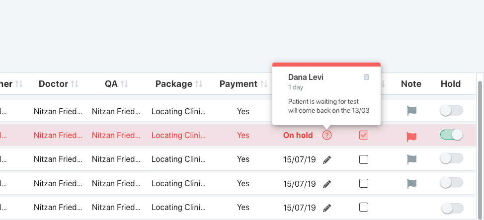
The design consolidated status, tasks, and communication into a single management board, with coordination tools built directly in, so the workarounds had no reason to exist.
Case overview — status at a glance
01
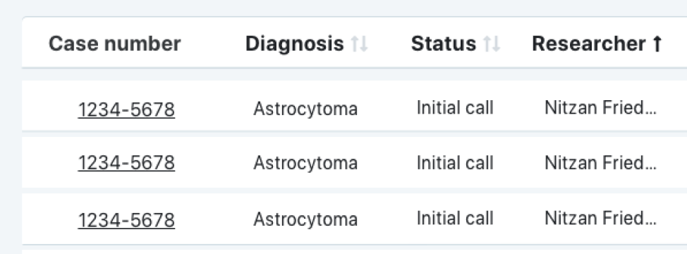
See status at a glance
Every case's current state is visible on one board, without switching to a separate status view.
Task panel — assignments in context
02
Keep tasks in context
Task assignments live next to the case they belong to, not in a separate tracker.
Coordination thread — provider communication
03
Bring communication in-product
Provider messages attach directly to the case, replacing side channels with an in-product record.
Handoff view — shared state across shifts
04
Make handoffs reliable
The next coordinator on shift sees the same complete state, no verbal handoff or private notes required.
Impact

What changed

One board, full picture
Status, tasks, and communication converged into a single view of every case.
Workarounds retired
Off-platform spreadsheets and side threads gave way to in-product tools.
Reliable handoffs
Shared state across shifts replaced verbal handoffs and private notes.
Want to see more?
Explore the rest of the portfolio, from contextual commenting to license governance.
All work License Management
Ortal Lampert · Senior Product Designer